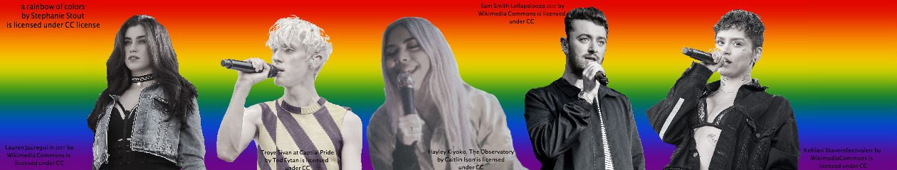
As this is a blog about artists who are in the LGBTQ+ community, in the header I wanted to use the visuals of some of the artists that have personally helped me. The artists I chose fo ray header from left to right are Lauren Jauregui, Troye Sivan, Hayley Kiyoko, Sam Smith, and Kehlani. I chose them because I fell as if they embody what it is to be apart of the LGBTQ+ community in the music industry. In their music they all embrace and proudly speak about their sexuality and share it with the world. I think this header will help relate to the target audience because they are well known artists who use their platform to speak about their sexuality and how its okay to do so, which is essential for the target audience.
All of the images that were used in the header come from searching through Creative Commons. Half of the photos I used came from Flickr, I made sure that the owner allowed for the picture to be used and manipulated. The other half came from Wikimedia Commons, where I also made sure that I was able to use and distort the images for the header. I knew that I was allowed to use and edit the photos because under the picture it says whether the author allows it or not. Also, on Flickr, it won’t let you download the image unless the owner allows the photo to be used.
When I was in high school, all four years I took graphic design so I am very familiar with programs like Illustrator and Photoshop. I had never used Pixlr before but after reading a few articles I found online I found out it is very similar to Photoshop. So before I started editing and creating my header, I did an overview of Manovich’s article to refresh all of the things I had forgotten from graphic design in high school. After than I was able to make my header into what you can see now.
My production process was similar to that of a single layer bitmap image like Davison describes because they both had to find a way to deal with jaggies. Due to pixelation this happened in some of the photos that I used and I had to find a way to make it not look like stair-step edges that Davison refers to them as. While this is a similarity I think that my production process was definitely required more time and effort than on of Davison’s bitmap comics.
